
14 Feb 2024
Whether you want users to buy a product, download a file or submit an enquiry, it usually boils down to them clicking on one big, bright button.
You might think the words on that button (the call to action, or CTA) don’t require much thought. It seems obvious what you should say: something like submit or next. And those words will certainly do the job. But they won’t maximise conversions.
Most people have a crisis of confidence when they’re about to commit to something. How they act on their doubt depends on context and cues. Cues like the words on a CTA button.
Taking the time to carefully consider this copy can make the difference between a sale and a missed opportunity.
CTAs should almost always start with an imperative verb that tells the user what to do. Remember: they’re calls to action, not menu buttons. That’s why Malmaison labels this button View Offers rather than Offers.

Adding now or today can enhance the sense of urgency, encouraging the visitor to act immediately. Just beware of overkill.
The CTA should make it obvious what clicking on the button will do. Any uncertainty will make users wary. That’s why Add to Basket is usually preferable to Buy Now on product pages.
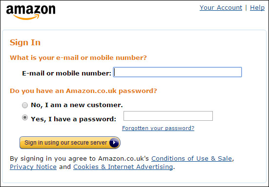
You should also inspire clicking confidence by reiterating benefits. For example, Amazon’s sign-in button reminds customers that the process is secure.
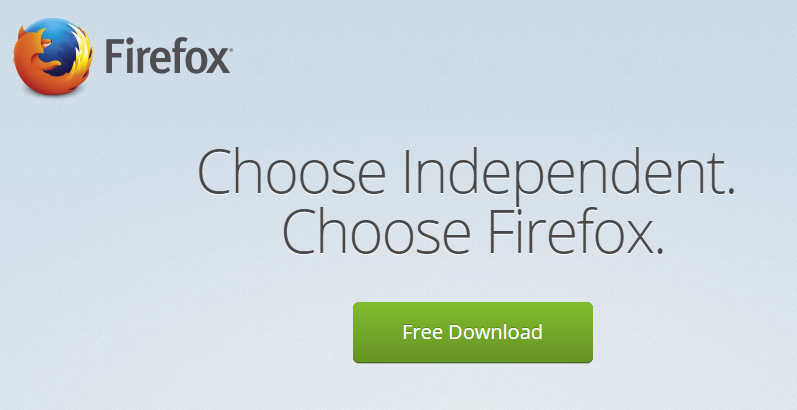
Firebox confirms that downloading is free in its CTA, although Download for Free (imperative verb at the start) might work better.
Copywriters usually stick to the second person (you, your, yours), as it helps them connect with the reader. However, research suggests that the first person (I, my, mine) is best for CTAs.
In split tests, Michael Aagaard found that changing Start Your Free Trial to Start My Free Trial boosted click-through rate (CTR) by 90%, whereas changing Create My Account to Create Your Account lowered the CTR by almost 25%.
Your CTA should focus on the benefit to the user, not what’s required of them to obtain it. Anything that sounds like it requires effort will turn users off.
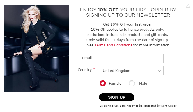
On this Kurt Geiger pop-up form, all the benefits are hidden in an unappealing chunk of text above the CTA. Changing the button copy from Sign Up to Sign Up For 10% Off could seriously improve the conversion rate.
Need more help improving your website’s conversion rate? Get in touch with the Glass Digital team today.
Top-performing ecommerce brands see affiliate marketing contribute 10–15% of online revenue. Answer two or three quick questions below to see where you sit — and what the gap is worth.
If you're not sure, ballpark it — you can refine this with us later.
The free audit
A 30-minute discovery call where we actually listen, followed by a tailored audit of your programme and competitor landscape — delivered back to you as a working document you can use regardless of whether you hire us.
No pitch deck, no pre-canned sales flow. We ask questions and build an honest picture of where your programme sits today (or where it could sit if you haven't launched yet). A sample of what we'll cover:
After the call, we do the real work. You receive a written audit covering: